top of page


The packaging for this project was created using several of Susan Kare's typefaces, including , ,
, and .
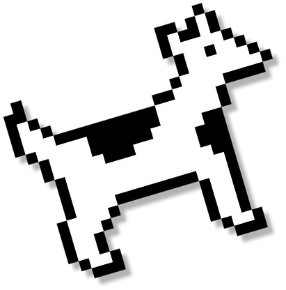
Repeating these fonts and a selection of four varying colors created the base of the packaging pattern. Two of Kare's most well-known icons-- the "Dogcow" and the Macintosh computer-- were used in a similar repetition to add a playful spark into the packaging and created a more dynamic final product.
Many of the same aspects were used for the poster, with the typeface Chicago being used as well as a monochromatic palette to create a style similar to the early Macintosh icons & design.
bottom of page


